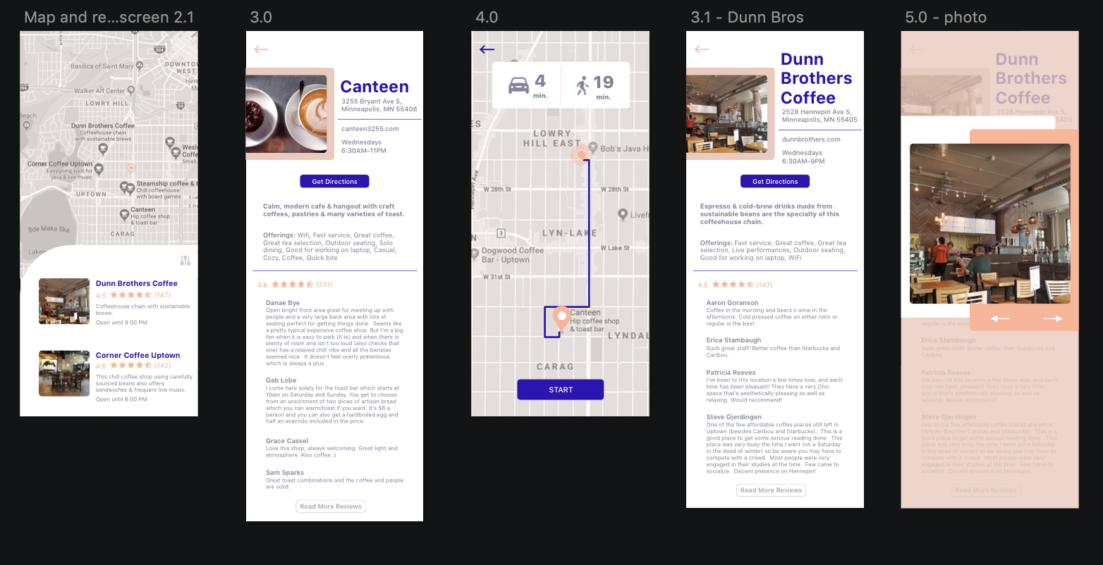
PostUp is tackling the common problem that many freelance or remote employees have - finding a public place to work that contains all the amenities they need in order to be productive. People who are generally working at public places like coffee shops or libraries want access to outlets, bathrooms, wifi, as well as a space that is not overcrowded where they can make phone calls without excess background noise.
Many people find places for them to work by Googling ‘coffee shops near me’, for example. From there they look at the pictures, to try and visualize the layout of the shop, as well as busy or popular times, and any reviews discussing the workspace/table layout.
I participated in a modified Google Ventures (GV) design sprint. During the sprint, I spent a day on each of the following: understanding the problem, sketching, storyboarding, prototyping, and testing, to design an application where users can find an available workspace to work at near them.
Day 1:
HMW Questions:
How might users find a workspace that matches their criteria?
How might we display available workspaces in a clear, understanding way?
How might users view the details of a specific workspace?
How might users view all available workspaces near their location?
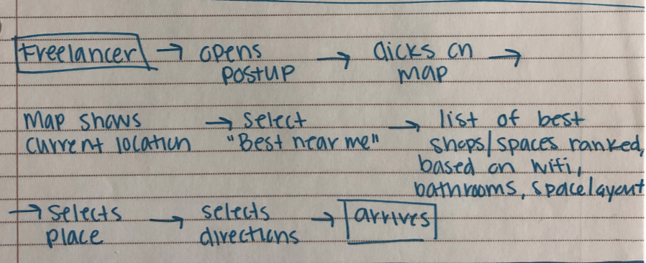
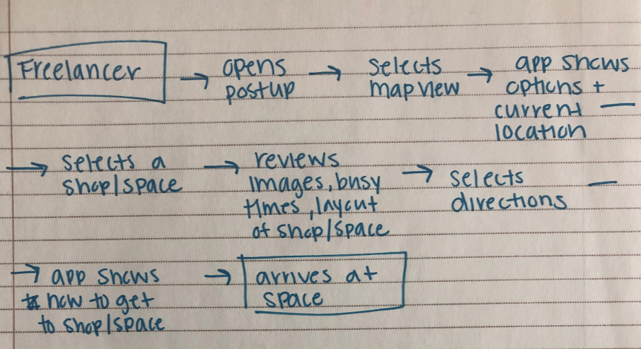
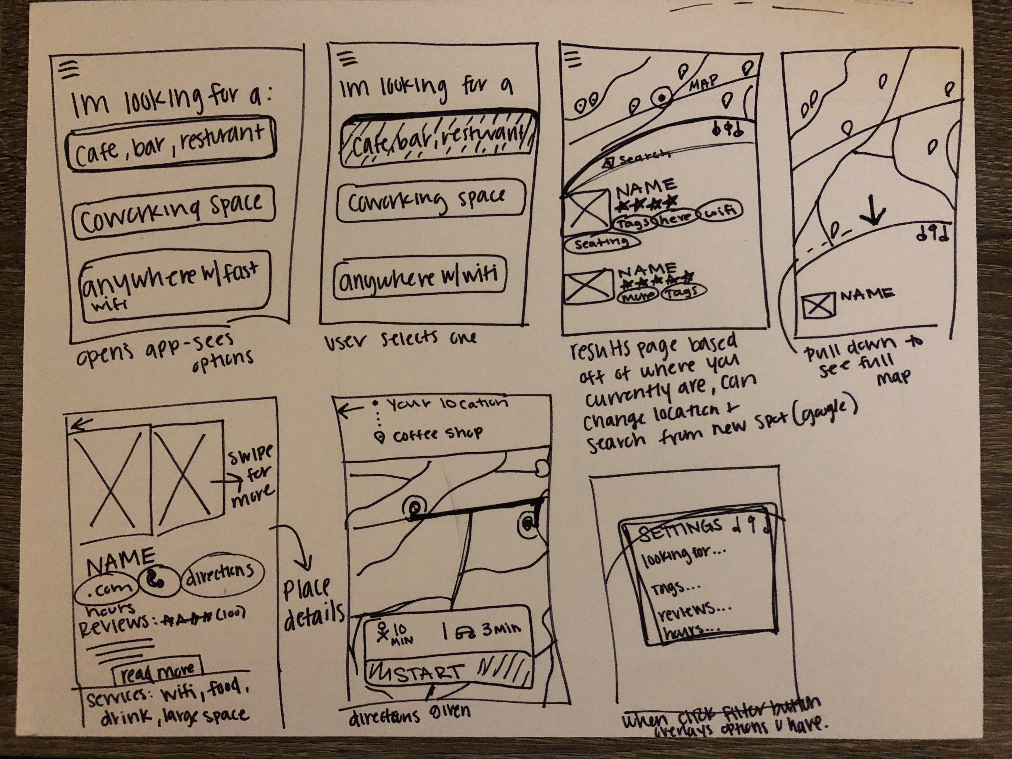
Three possible end-to-end experience map of the users’ process throughout the application.
Day 2: lightning demo, finding inspiration
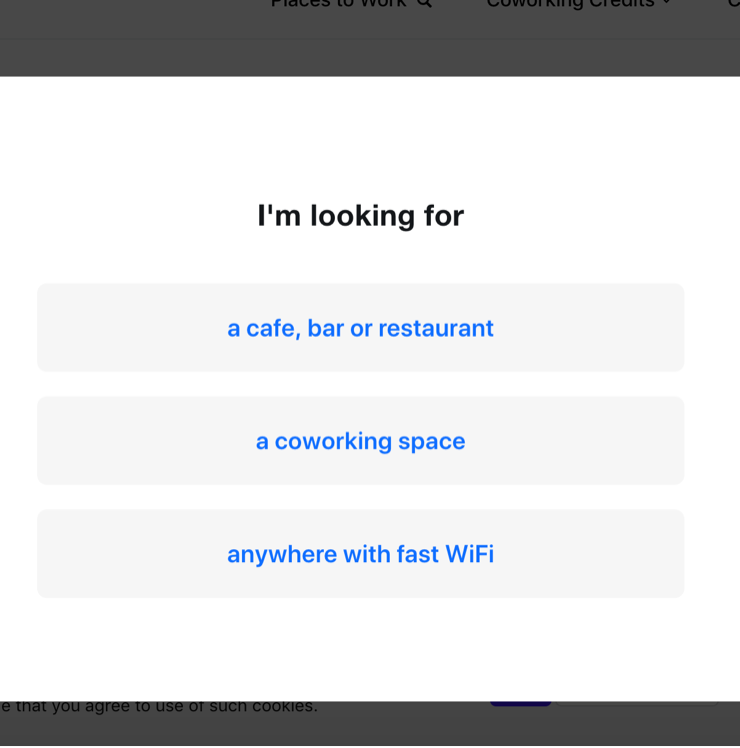
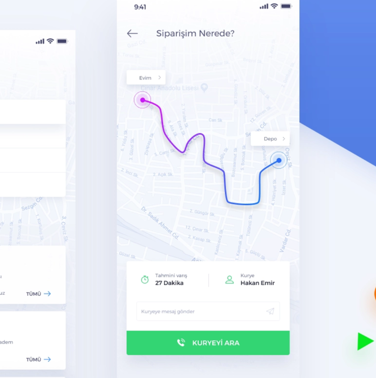
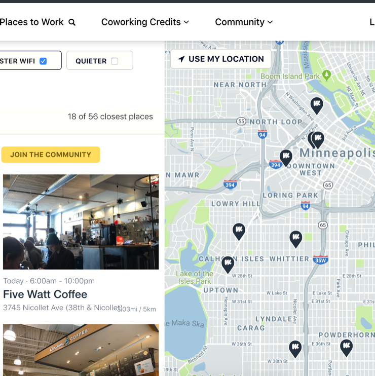
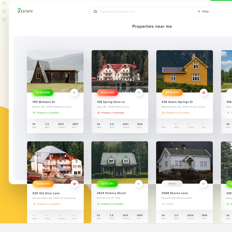
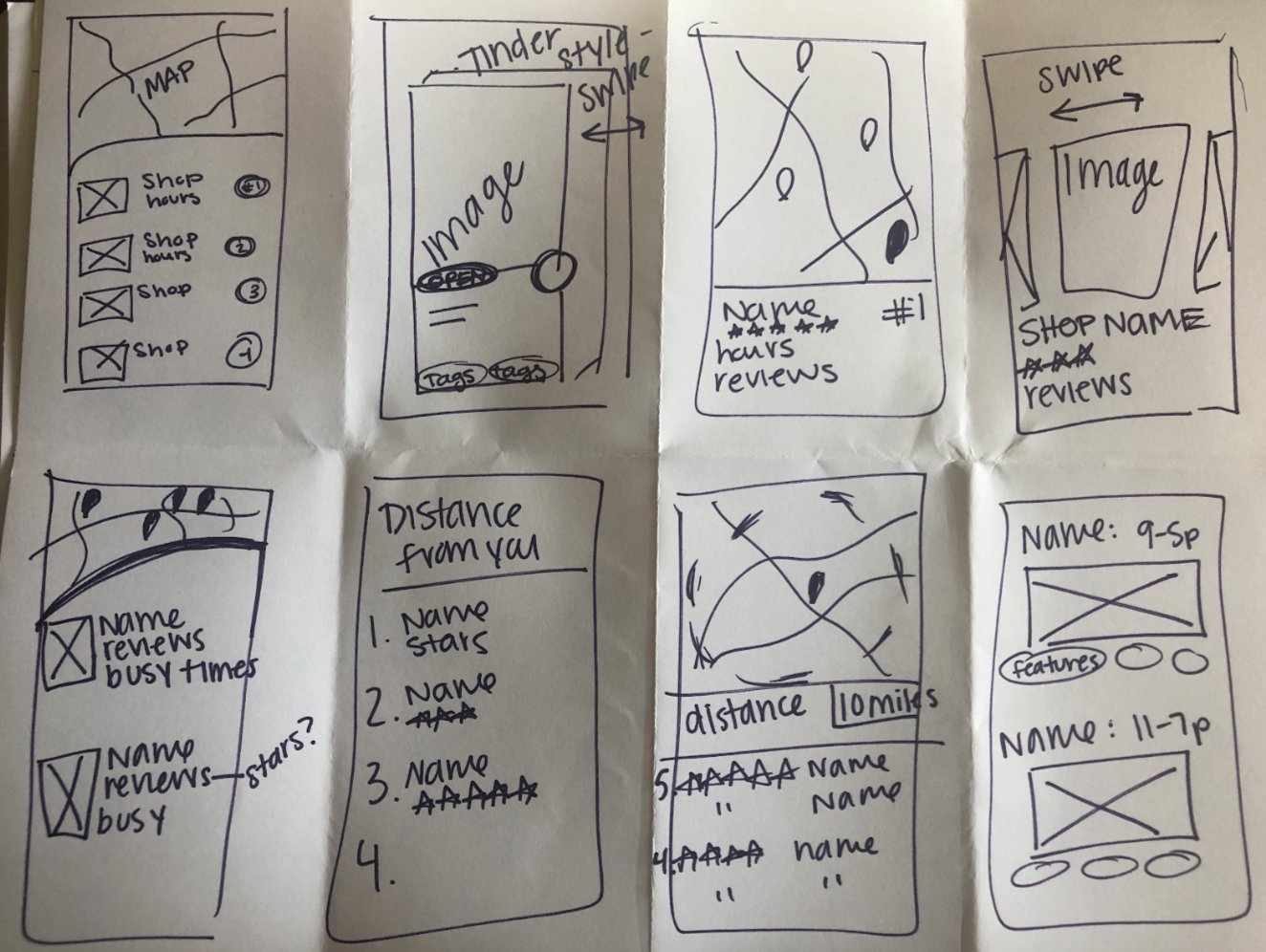
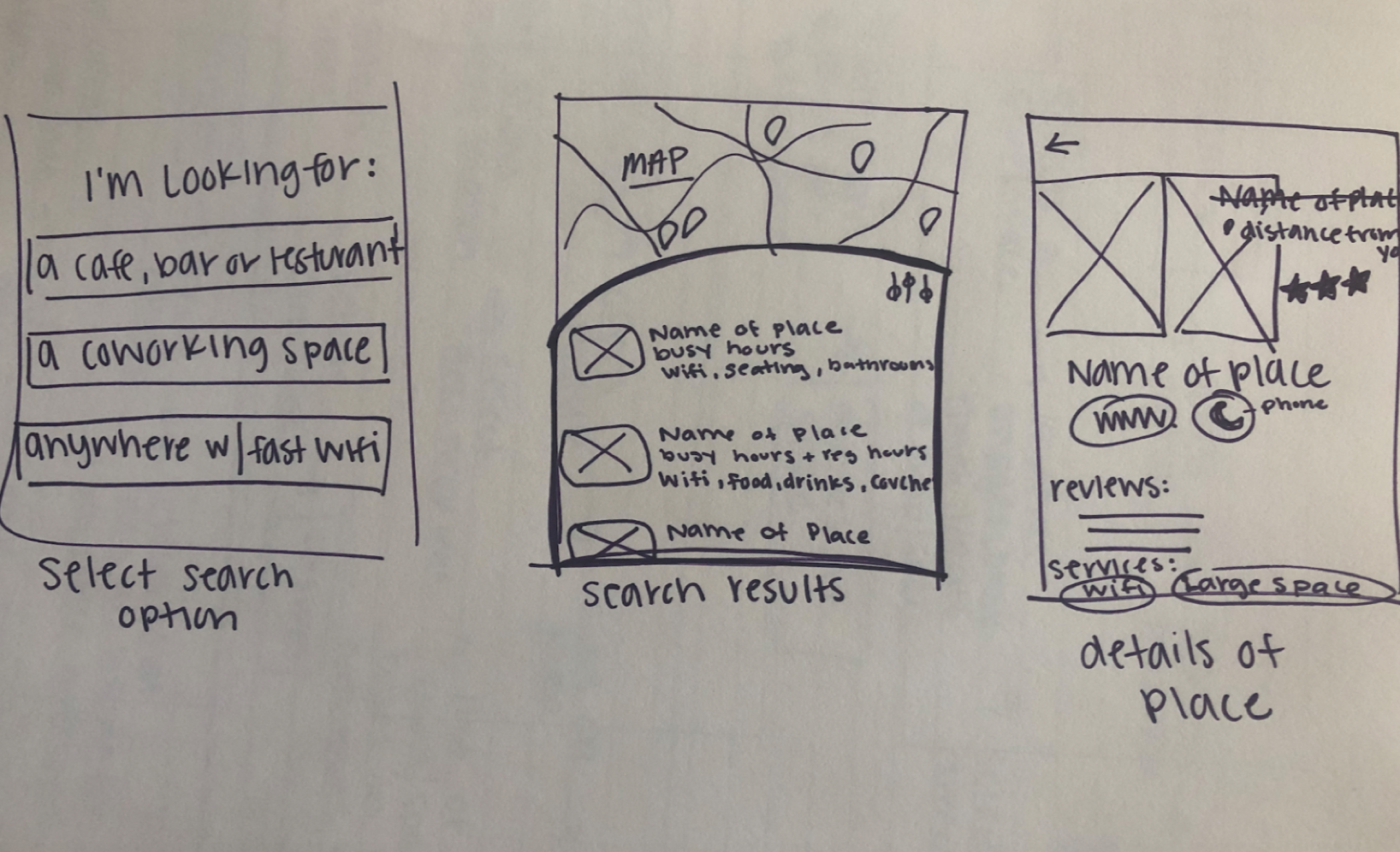
After finding some inspiration from the lighting demo, I did a crazy-8’s exercise to find a solution to the problem. I decided the most critical screen was the results page since all users would see and interact with this screen each time they were looking for workspaces near them.
Day 3:
I wanted to make the process simple for users who are finding a workspace to work at for the day. After finding and sketch the critical screens and the screens that surround it yesterday, I began developing a storyboard. I started with a question to the user right away, of what kind of a workplace they were looking for on this particular occasion that they opened the application. From there they are shown a map with relevant results to the places near them. They can get more details of the specific place by clicking on the name of the workplace, which will also give them directions.
Day 4: Creating a Prototype
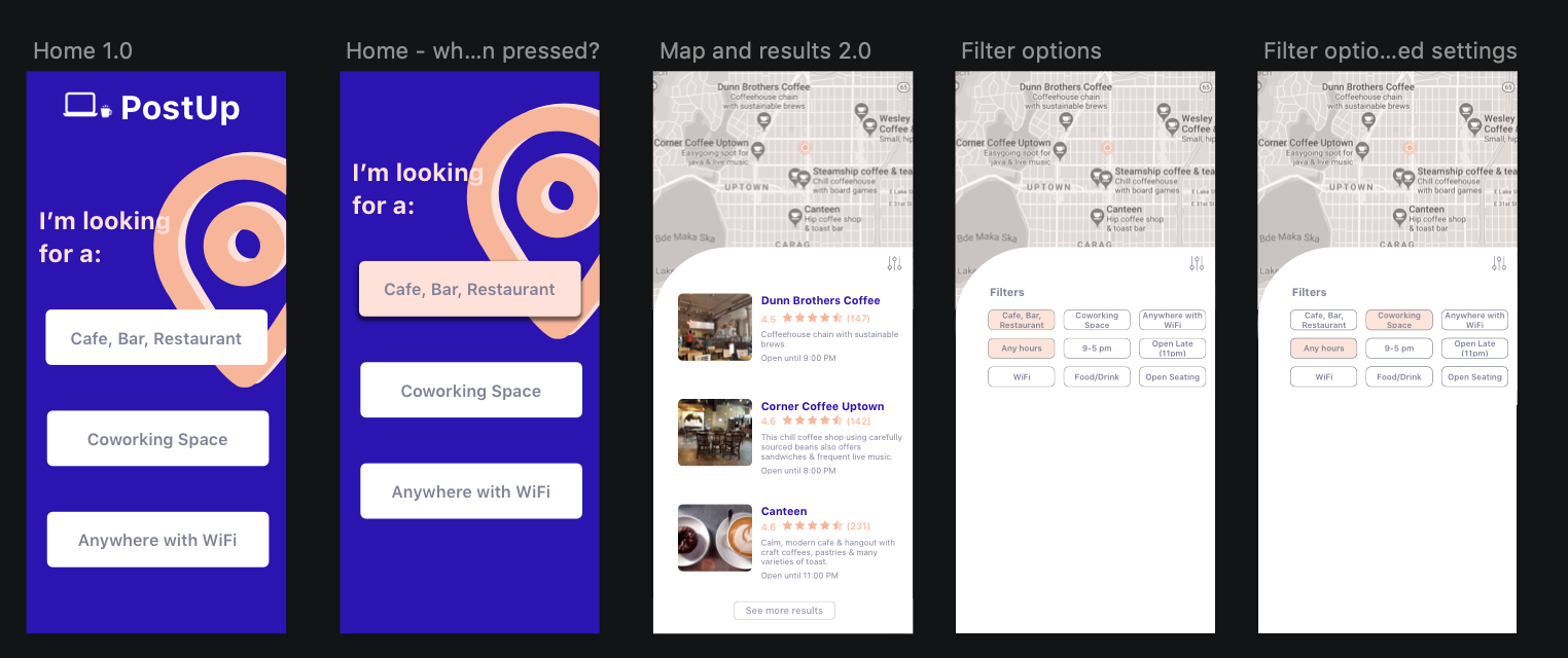
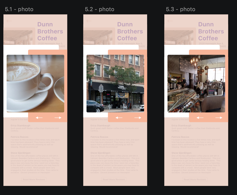
Below is the end result for the PostUp project. The overall process was straight forward, I had an idea of what I wanted the product to look like and how it could interact with users. Finding inspiration before starting the actual prototyping process, made it a lot easier for the application to conceptualize.
Day 5:
I interviewed a total of 5 users. Three of those users are current students who often look for other places to study from. One user is applying to jobs and uses coffee shops or the library a few times a week to focus. The last participant works from home and wants to work at other locations, but is not sure where to find those new locations.
A goal I had for testing the prototype, was for users to be able to see reviews other people have made, the shop hours, as well as find directions from their location to a shops location.
The experience I had interviewing and testing the prototype was overall really rewarding. It was fulfilling to see and watch potential users interact with the application and hear their feedback on every feature of the application. After interviewing, some of the findings I discovered were that all of the participants enjoyed the landing page, how the user is able to select a search filter right away. The participants that tested the application also liked the split map/search results screen, and the overall simplicity, or layout, of the text on the screens.
I noticed, however, that none of the participants realized that there were more pictures to view of the coffee shops. Which would be something to look to change in the next version of the application. A few feedback comments and ideas the participants gave me also, were to have the option to go back to the landing page after a search, to have more filter options, and adjust the reviews section to show a brief summary of reviews. If the user wants to read further have a ‘read more’ button for them to select.
