When was the last time you went out to eat since you didn’t have enough time to find a recipe or a meal to make at home? Or the last time you threw away food that went bad before you were able to enjoy it?
Many of the millennials I’ve talked to love to cook. They find it relaxing, or exciting. However, they struggle with finding time in their busy schedule to prepare meals and find new recipes to make. Many of the recipes people find need a few ingredients that they don’t have or will take too much time to cook, having the easier option to be buying some already prepared food. When this happens millennials often don’t utilize all of the food that they have at home and end up throwing away extra food waste.
I designed a recipe application that would help users, and millennials, quickly find new recipes, find recipes from ingredients they currently have and limit their overall food waste.
1. Research
I started with trying to learn more about the experiences millennials had involving cooking and food waste. Along with conducting some secondary research, I also developed a survey with potential users. I sent the survey out to participants who cook at home often, have followed a recipe before, and use applications on their smartphones.
Survey Questions:
- “How do you typically think of meals to cook?”
- “When following a recipe, where is the recipe located?”
- “In the past month have you found yourself throwing away spoiled food items? What were those items?”
- “What would help you limit throwing away food, and/or help you come up with meal ideas?”
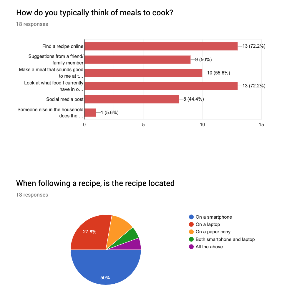
The responses I got from these survey questions intrigued me. Many participants find recipes from the internet, or by looking at what food they already have at home. 50% follow a recipe on a smartphone, 27.8% on a laptop, with only 11% following a paper recipe (Image 1.0).
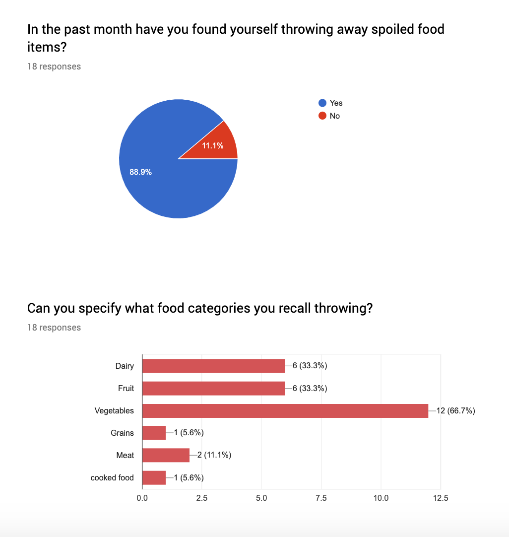
It also surprised me that 89% of these survey participants admitted to throwing away spoiled food in the past month, with vegetables followed by dairy and fruit being the top three categories thrown (Image 1.1).
Image 1.0
Image 1.1
These responses verified my thought that people commonly millennials, find recipes from the internet, and use some type of technology throughout the cooking process. They also want to limit their food waste but are not quite sure of multiple recipes that contain larger portioned ingredients that they have, or what recipes contain many of the ingredients they have at home.
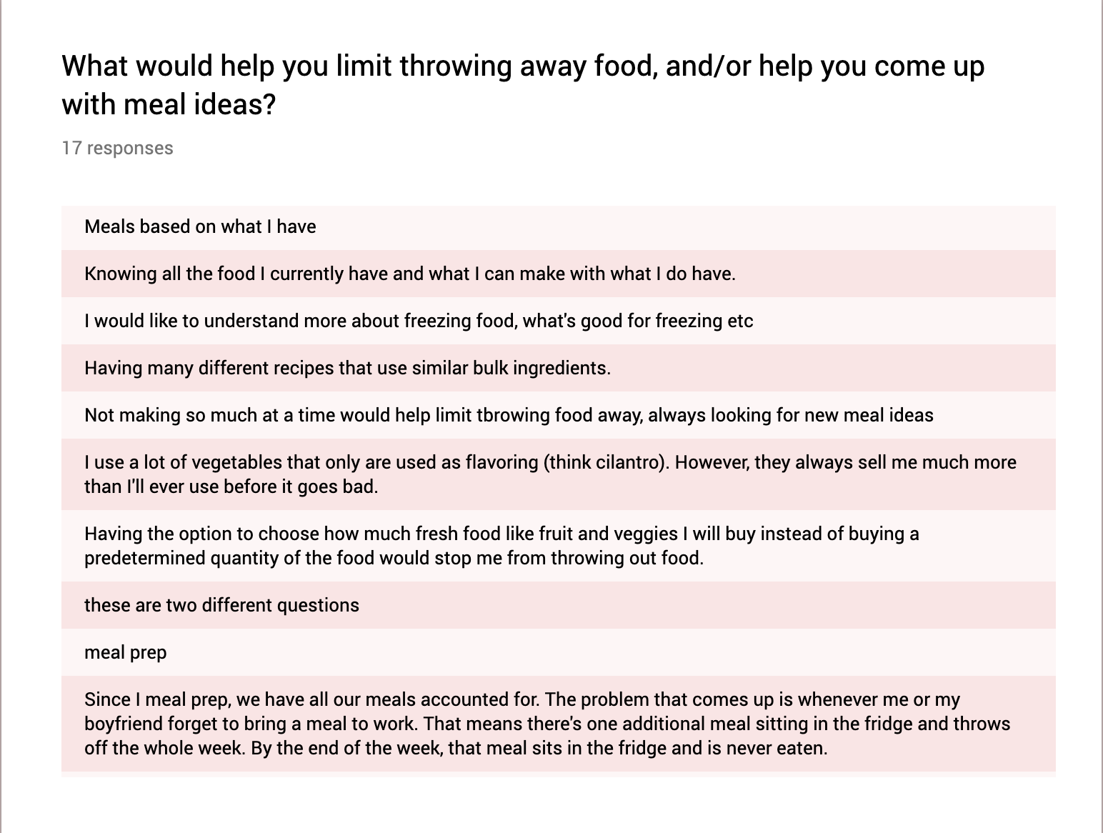
Image 1.2
Interviews and User Insights
To learn more about specific trends discovered in the survey process, I reached out and interviewed some users about their recipe and cooking habits.
In user interviews I had several users say that they had trouble using up all of their larger portioned food items before they expired, which led me to include a “current ingredient” section and a search screen in the application where users could search for recipes with those leftover items and specific amounts of an item.
“If I make anything with lettuce, normally it gets wasted. Or larger portion items, I have trouble drinking a whole gallon of milk by myself, or using a whole tub of sour cream.”
I also had many people say that they don’t have a lot of time to cook or find a meal to make. This led me to believe that they need to be able to find recipes quickly and be able to see how long that recipe will take to make.
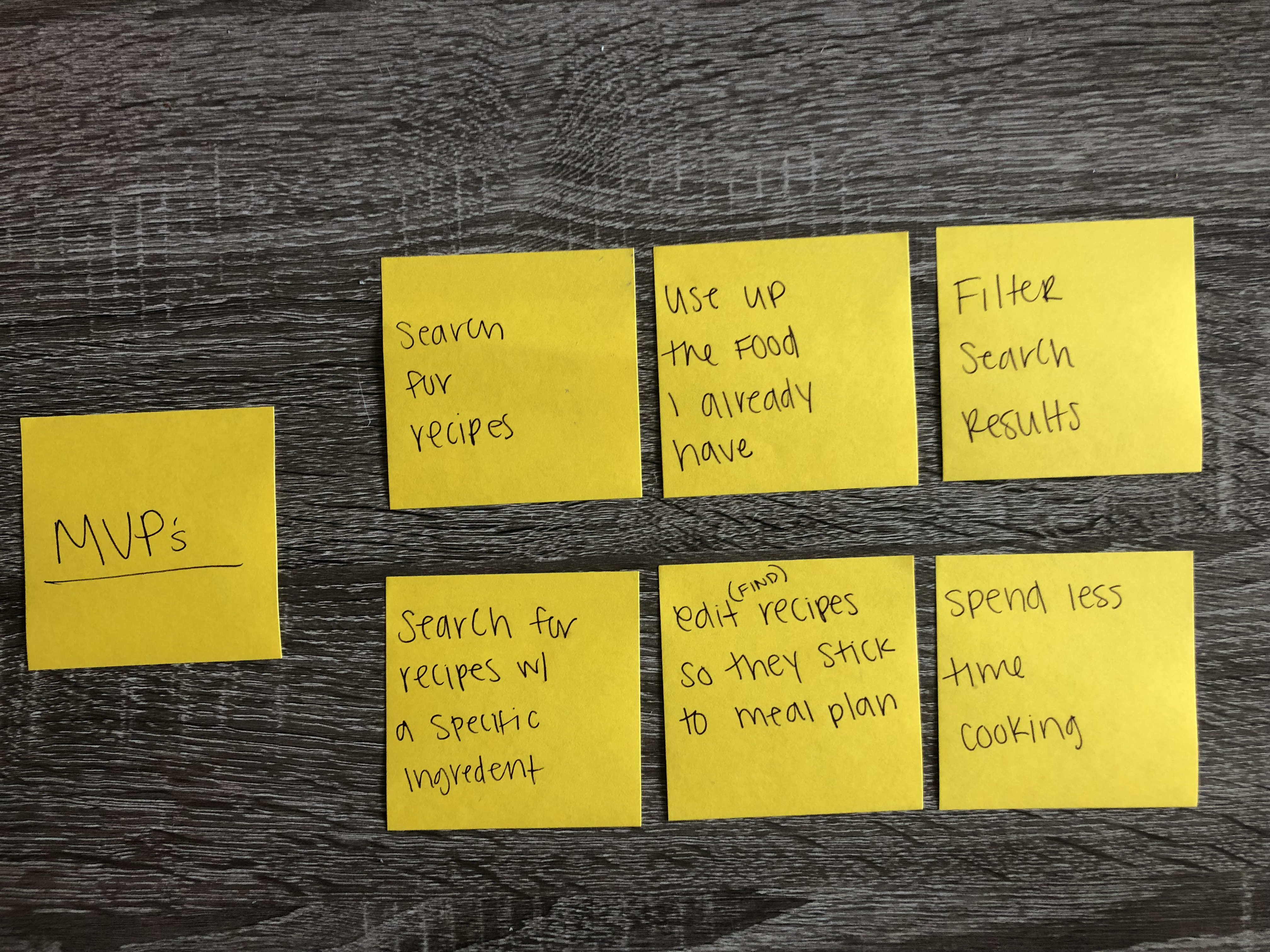
After the interviews, I condensed the data into six main pain points, as can be seen in image 1.3. I also wrote five 'how might we' questions to better understand the users wants and needs.
- How might we shorten the time Millennials spend cooking during the week?
- How might we suggest shorter recipes, quicker meals, and ways to meal prep to Millennials for their workweek?
- How might we edit ingredients and allow flexibility within a recipe?
- How might we decrease food waste in Millennials?
- How might we help Millennials find recipes faster and find recipes from the food they have on hand?
2. Personas
Based on all the data I had collected, I created personas of the two main user types. These personas are not direct representations of specific people but a representation of my main two user groups based on the observations and insights of people who took the survey and were interviewed.
John’s persona (2.0) depicts the characteristics of a new college graduate who works a 9-5pm, Monday - Friday job. John wants to save as much money as they can to pay off their student and car loans. They also don’t have a lot of free time day-to-day, so they are looking for quick meals that use up large ingredients they have, as well as meals that have the option to be used for 2-3 meals.
Emily's persona (2.1) depicts the characteristics of a user who is currently in an online graduate program. Emily works from home and spends most of her day working on her graduate program or remote job. They like to save money whenever they can. She enjoys cooking new meals for dinner every night. A concern she has is being able to use up the full amount of an ingredient when cooking and limiting her food waste.
3. User Flows
As I discovered what users would like to have in a recipe application, I came up with three main features to have within the app.
- Search function
- Search for a recipe title
- Search by an ingredient
- Search by ingredient using a food category system
- Saved recipes
- Current ingredient list
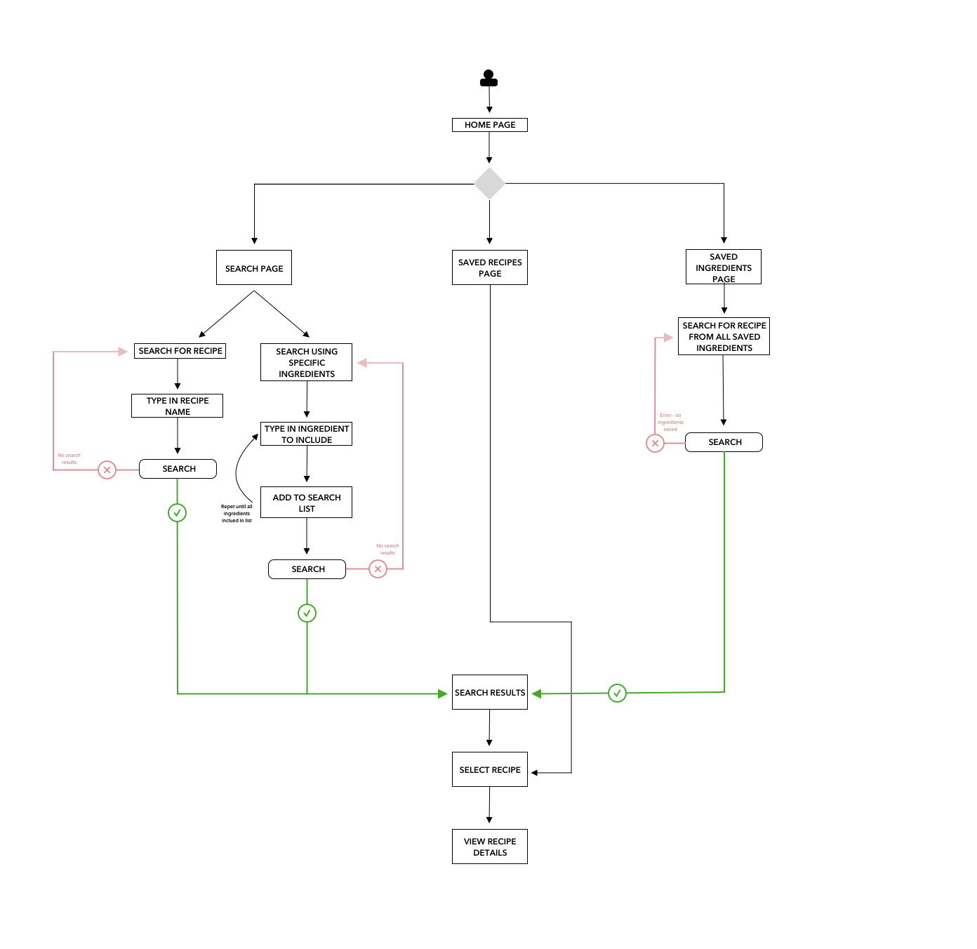
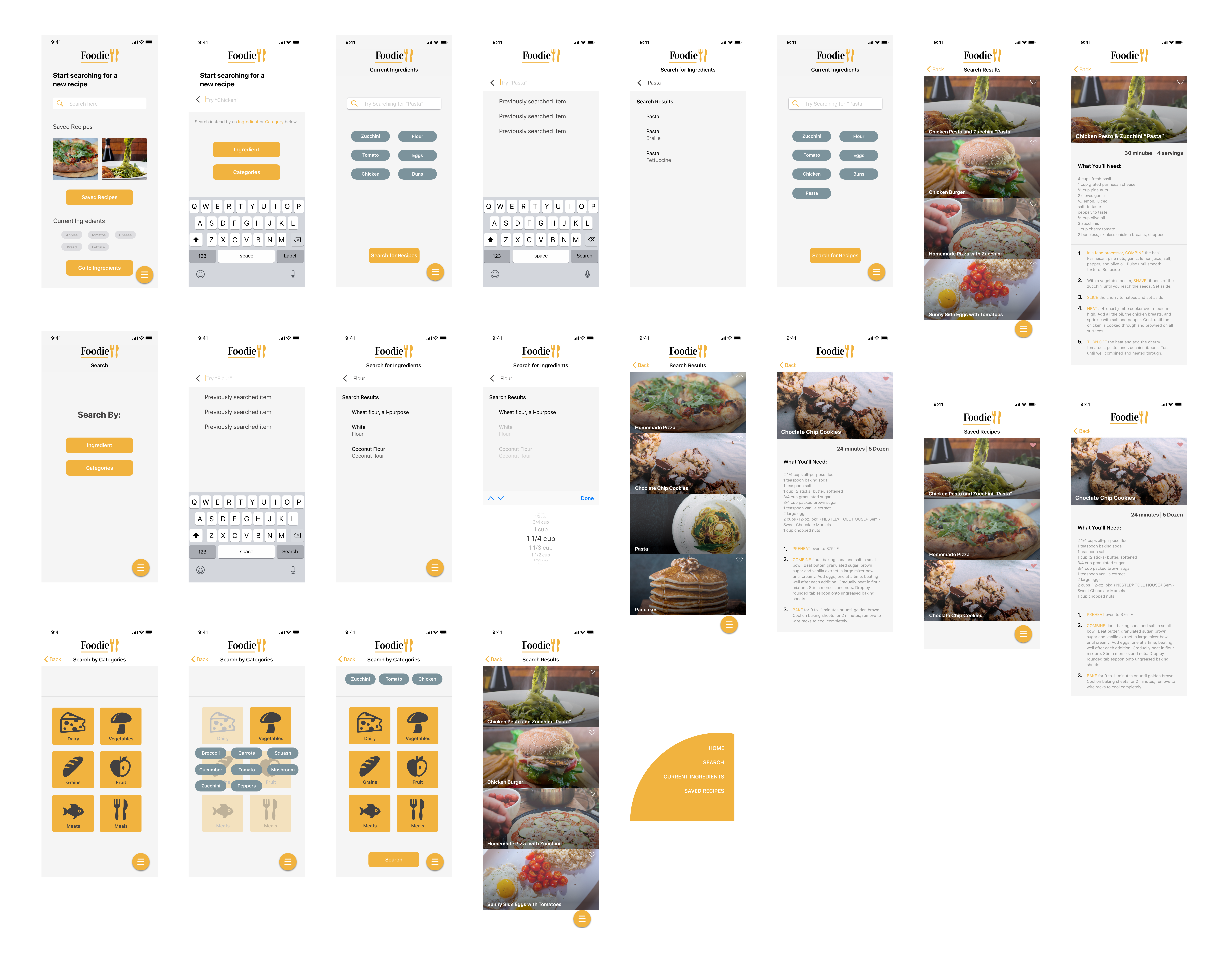
To get a better understanding on how a user would interact with the application, the process they would take to get from point A to point B, I created a user flow to visualize that process before beginning to sketch out initial designs.
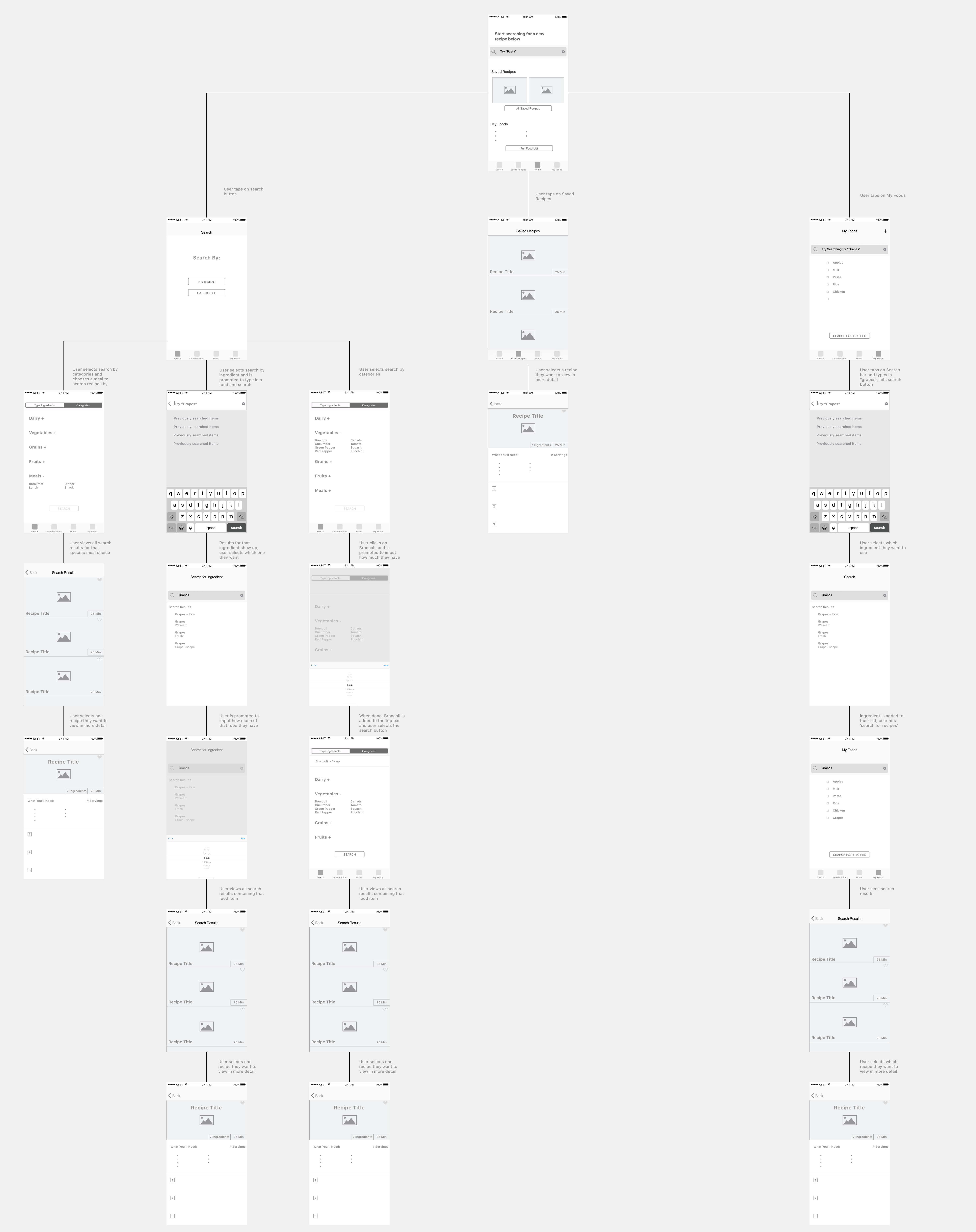
4. Initial Sketches
From the user flows, I created some ideation sketches that would fit the user's needs. To see if my ideas aligned with potential users, I conducted a guerrilla usability testing session. During that session, I asked participants who were all within the millennial age group to complete three tasks.
- How to search for a recipe
- How to find recipes from the food you already have
- How to view a recipe or any saved recipes
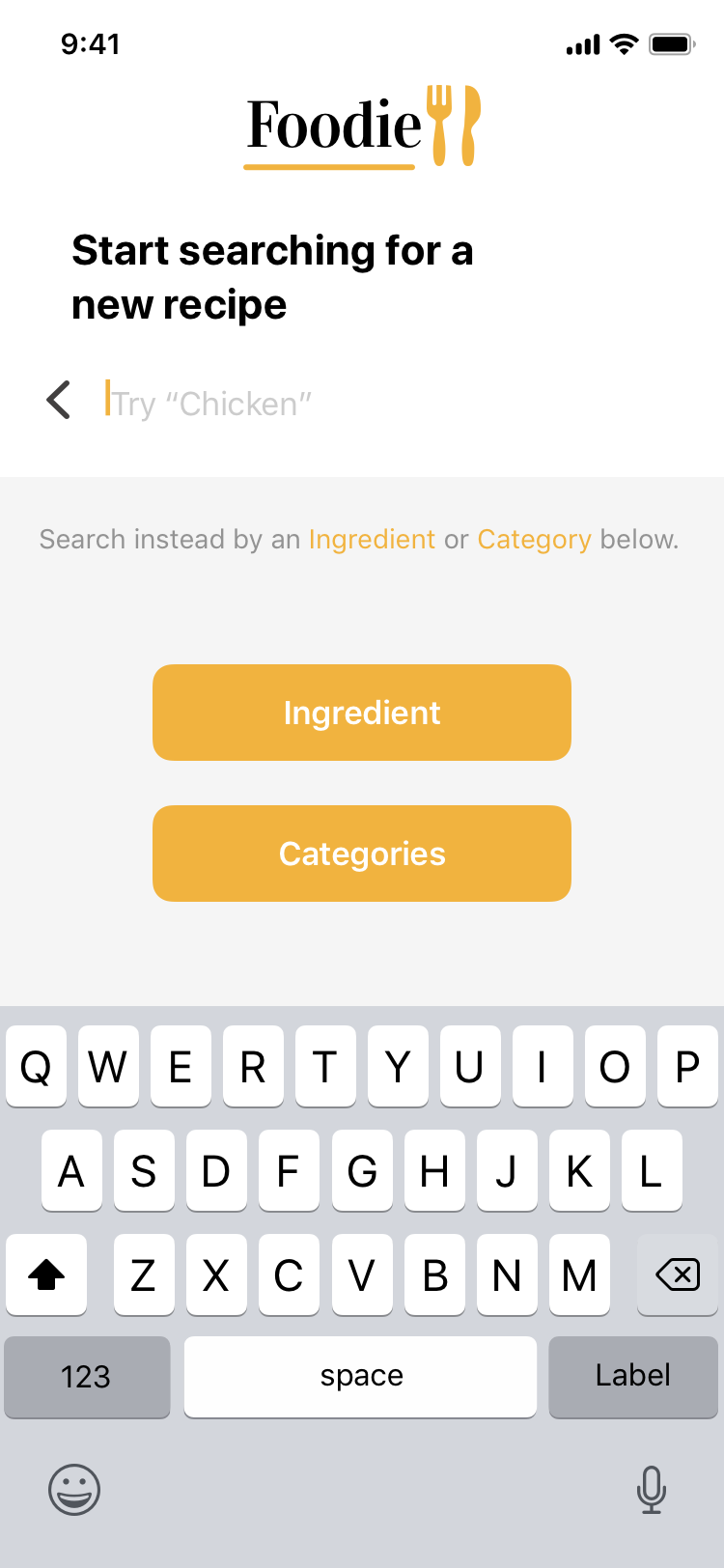
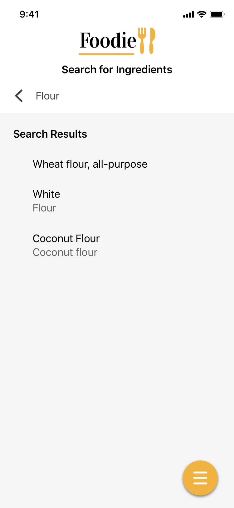
From the testing, I discovered that although all of the participants were able to navigate the application quickly, the language and title of the ‘your ingredients’ page were confusing to most. I also needed to make the ‘find ingredients by categories’ screen more pronounced and noticeable, since participants did not see that option.
6. Style Guide
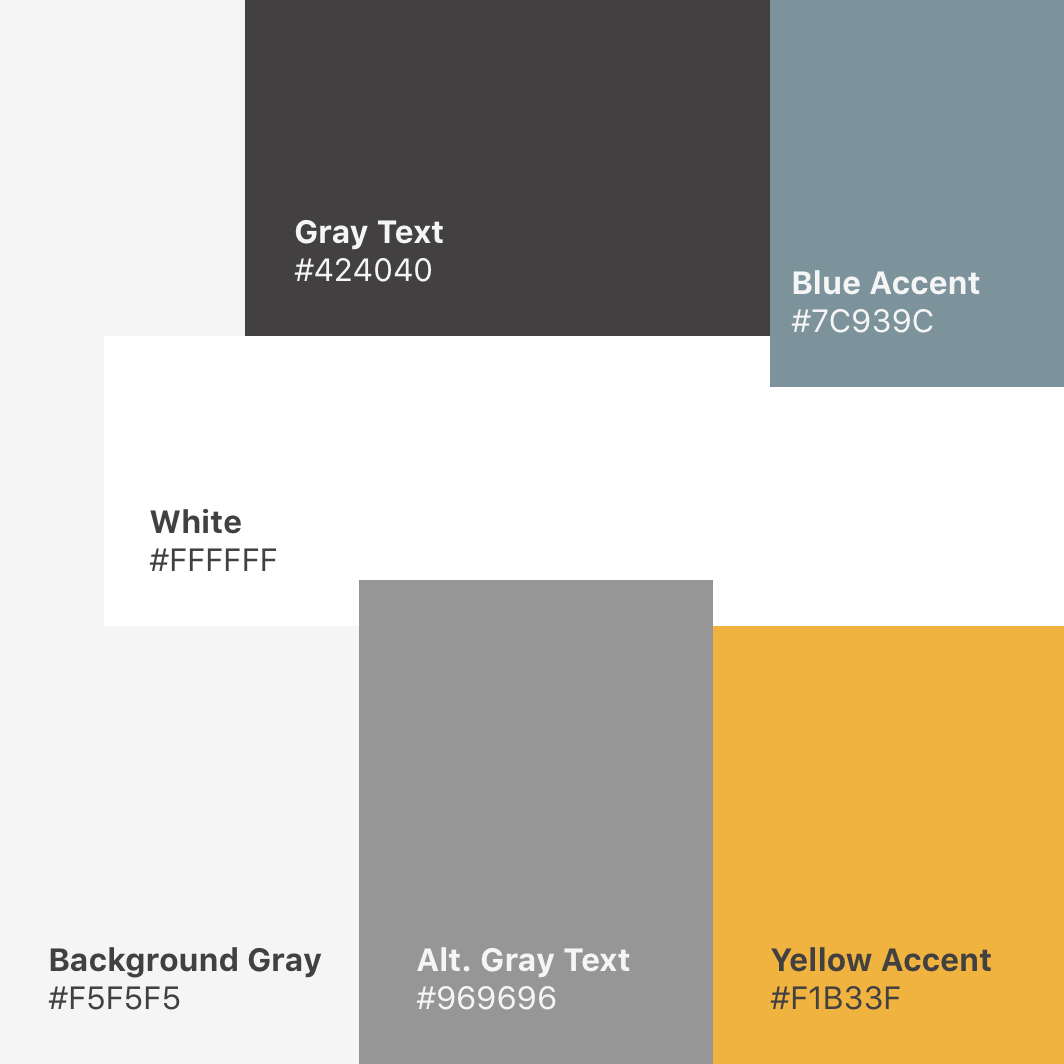
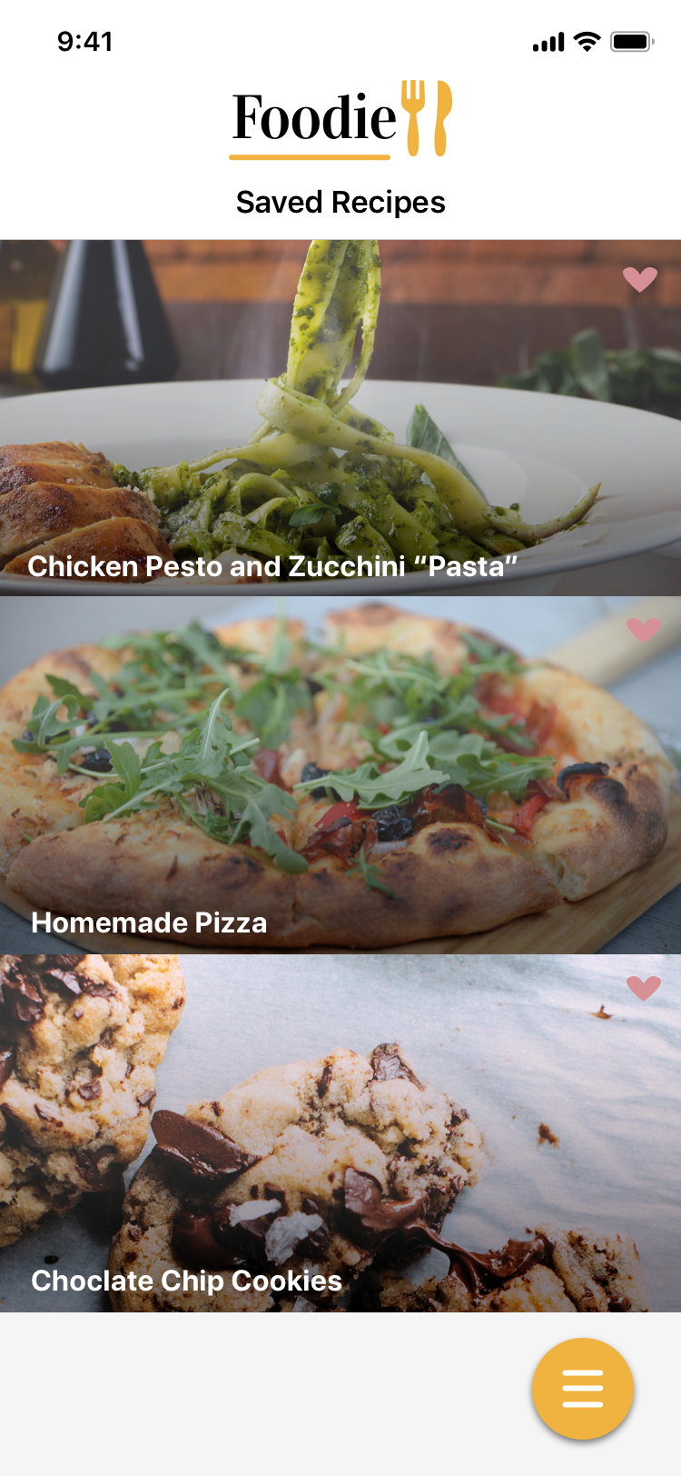
I really enjoy clean and crisp styles within applications, and wanted to involve that with this recipe application. I decided to pick a light gray color for the background, with a dark gray as the font color, along with a pop of mustard yellow for the buttons and navigation.
For the typography, I choose the font face SF Pro Text and SF Pro Display. I wanted an organized font face that had high readability for users.
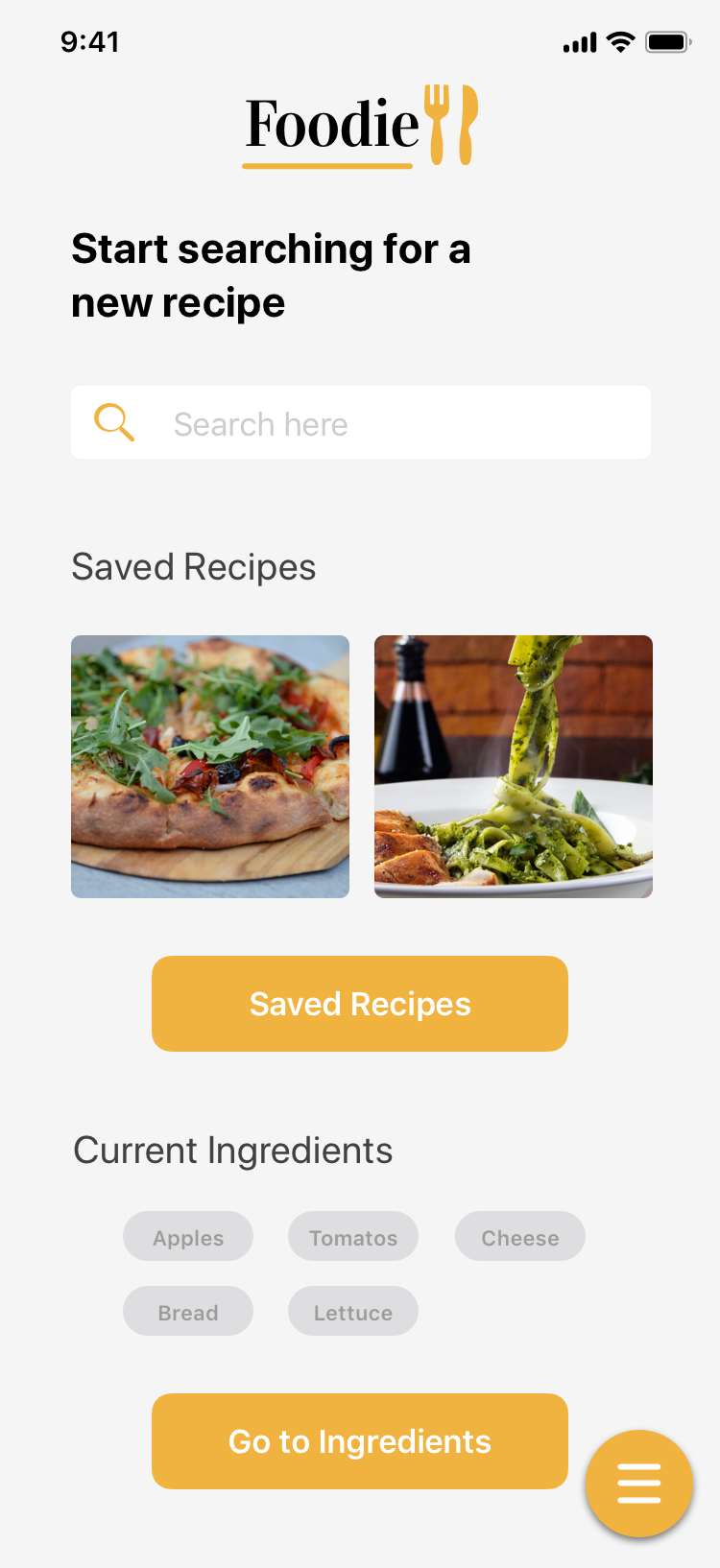
7. User Interface
Usability Testing
In the first round of testing, I conducted 5 testing sessions to better understand the UI in the mind of potential users. For the second round of testing I conducted another 5 sessions with different users. I tested all of the users with either moderated sessions, unmoderated, or moderated remote testing.
My main goal of conducting usability testing was to confirm if users really understood how to use the search options, saved recipes, as well as the current ingredients page, and how they navigated the application. Tasks I had the users complete were:
- Can users switch between pages without going back to the homepage
- View a saved recipe
- Find a recipe based off of the ‘Current Ingredients’ screen
- Find a recipe by using the ‘Search by Category’ option
- Find a recipe by using the ‘Search by Ingredient’ option
Results from the first round of usability testing:
- Users were able to complete most of the tasks easily
- Some had difficulty finding the ‘Search By’ page to complete some of the tasks
- A few users tried to click on the logo at the top of the screen to navigate home, instead of using the navigation button.
- There was some confusion on what the purpose of the ‘Current Ingredients’ page was. Most of the users were able to correctly state what they roughly thought the page was for before entering that screen.
- When asking users a question relating to the search function, it took them some time before realizing that they needed to go to the search page through the navigation (in this first version).
Results from the second round of usability testing:
- After the updates from the first round of testing, in the second group, everyone was able to find the ‘Search By’ page, and complete the tasks involving the search by ingredients/categories options.
- 3/5 users tested took a longer time to notice that they did add an ingredient to their search list, compared to the other two users, when within the ‘Search by Category’ option.
- Almost all of the users, when asked a question about searching for an ingredient, clicked on the search bar on the homepage and were able to complete the task.
End Result:
Overall I was really pleased with the success rate of users who were able to complete the tasks.
- All of the users were able to switch between pages at least once by using the navigation
- The users found the saved recipes page quickly, with about half using the navigation while the other half used the button on the homepage.
- They also seemed to really like the overall layout, color scheme, picture choice, and how easy it was to read a recipe from the search results.
![Capstone Persona(s) [LaurenTurner]-03](https://laureneturner.com/wp-content/uploads/2019/09/Capstone-Personas-LaurenTurner-03.png)
![Capstone Persona(s) [LaurenTurner]-02](https://laureneturner.com/wp-content/uploads/2019/09/Capstone-Personas-LaurenTurner-02.png)
